
Page 257 - 1990.Millard.North
P. 257
·Chrissy niederhaus-
There was no doubt about it more Melissa Doro. It had a lam- still with contemporary intent. and placed at the end of each
. . . the year had gone so fast. inated white background with the simplicity of A vente Garde caption. A company folio art
It was now officially the nineties Aqua #320, Bright Red # 192, typestyle was chosen. A Brush was used for the page num-
and the beginning of a new and Tiger Yellow #123 title. type was used on the Aca- bers, and the page number as
era. So many innovations had c lock. and stripe. demics heading, and the Peo- well as the folio tabs were 12
already taken place. The world The main book and the sup- ple and Sports sections both point and 8 point respectively.
was moving forward at an in- plement were printed on # 80 had headings created on the Instead of adopting a differ-
credible pace. enamel finish paper. The end- Macintoch computer. ent column width for the Stu-
To add to some of the more sheets were white with Process A 36 point bold style of dent Life section. as was usually
traditional methods. the year- Blue and Emerald Green A vente Garde was chosen for done, a 2" column was used
book took some different ap- screens on the Macintosh gen- the Student Life headlines and throughout the book. This pro-
proaches this year as well. After erated title page artwork. sub-headings. 72 point of the vided not only a new look. but
debating for a week. the staff Spot color was added on the same style was used for the it gave the book unity and con-
chose No Time for Looking introductory pages for the first main headings in Student Life. sistency.
Back as its theme and set to time this year. It alternated in For the first time, the headlines Mike Diffenderfer and Brenda
the task of designing a cover. different gradations of Process for all three sections: People. Search deserve special thanks
Once again, the Walsworth Blue and Emerald Green. The Academics, and Sports. were as Walsworth representatives.
design department aided the spot colors that were featured all the result of Macintosh art- Their innovative ideas, as well
staff in the decision. Several at- on the divider pages were Pro- work. Thanks to Senior Beth as their undying patience were
tempts finally yielded the pres- cess Blue, Bright Red #192, Peake for designing the class greatly appreciated. Thanks
ent cover. which was designed Royal Blue, Emerald Green, and year numbers for the people di- are also extended to Sopho-
by the company, and based on Royal Purple #273 accordingly. vider pages. more Eric Johnson for his art-
the original design of Sopho- In keeping with tradition, but This year the staff decided work and to Rick Billings And
against an initial letter. siding in- Jack Martin for their photo-
stead with an initial point cap- graphic expertise. Each of
tion. The first phrase of each these people added their own
caption was highlighted in a 12 special touch to make this the
point, compared with the 8 ninth successful edition of the
point of the rest of the caption. Stampede. e
Photo credits were italicized
ChrissyN· .·················· .. ··
Kelli Mahoney ·········· ··
Michelle .Welch )<
Tammi Cisler·.·.·
...
KimHJles ' I (.:A'. -
1
:::hd;r~~:~ '~f~ ':,: , - ..
Mike segi'eio .q§t ·
Ste_ve -V.
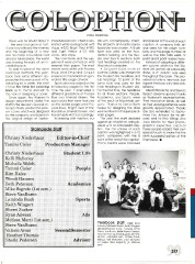
Yearbook Staff: front · Ryan
Adwers, Michelle Welch, Keith Wingert;
second·Tammi Cis ler, Valerie Arms,
Steve VanBuren; back·Wendi Hansen ,
Heather Thomas, Sherri Zucker, Beth Pe-
terson, Laminda Bush , Chrissy Nied-
erhaus. Kelli Mahoney. (not pictured:
Kim Hales , Mike Segreto) (R. Rasmus-
sen)
253